Collected Curios
Would you like to react to this message? Create an account in a few clicks or log in to continue.
Collected Curios

The new forum for all things related to collectedcurios.com.


You are not connected. Please login or register

BeDaOrLiSeAr's Attempts: Drawings And Pictures

+15
not_cenaris
Xenathos
26_9
Vordreller
Youchip
CrazyPurpleBat
noctrnlcry
swordfish
cenaris
Smelge
Frist
Pietja
Nikolai
Damien Darkside
BeDaOrLiSeAr
19 posters

Go to page : Previous  1 ... 10 ... 16, 17, 18, 19  Next

Go down  Message [Page 17 of 19]

BeDaOrLiSeAr

BeDaOrLiSeAr

Dreadstunlock wrote:Now I know BeDa, you probably will be a cartoon animal drawer and antromorph specialist in a near future, but I think these will help you out, and so is for everyone. Lineweight does not have to be in one go, you do the initial outline, and not being lazy, make your brush on +2 bigger, and go over some off them and experiment.

https://www.youtube.com/user/FZDSCHOOL

BeDa this one is for you:

https://www.youtube.com/user/FZDSCHOOL#p/u/49/eKndZHlcgFE

Watch the bottom link, and the first link is the guys channel, he is a professional concept artist, and he will teach you so much about photoshop, might even change your career.

(When I say professional, I mean full on throttle professional who makes big bucks.)

O.O Wow, thank you so much, I think this will help alot!

BeDaOrLiSeAr

BeDaOrLiSeAr

A coloring attempt:

BeDaOrLiSeAr's Attempts: Drawings And Pictures - Page 17 Black_11

BeDaOrLiSeAr

BeDaOrLiSeAr

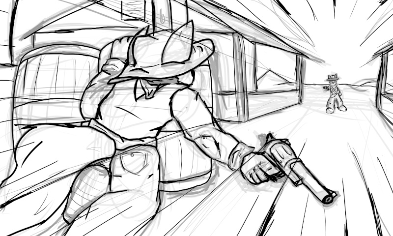
I decided to practice perspective/action, and I got this doodle. Its not meant to look good, I just want to know if I got the perspective at least decent or not.

BeDaOrLiSeAr's Attempts: Drawings And Pictures - Page 17 Perspe10

Nikolai

Nikolai

hmmm, more or less it looks good, but personally I think the foreground should be a little lower then the background. But, what do I know.

http://nikolai-bartolf.deviantart.com/

ugilick


I havnt done alot of art myself recently, but I can look at that and tell its out of perspective. When I did art it focused on drawing structures and landscapes in a realistic size and positioning. Your horizon line is to high, and your building dont draw the eye to the same veiwpoint, the angles are off. The barrels also look somewhat flat. All that said I would say this is pretty good. Smile The characters are much better then their environment. The center characters perportions seem pretty beleivable, and I rather like his positioning in the peice. Whats up with his left leg? is there a patch on his pant's leg? Speaking of which, I like the way you drew his clothing. I hope this doesnt come across to negative.

BeDaOrLiSeAr

BeDaOrLiSeAr

ugilick wrote:I havnt done alot of art myself recently, but I can look at that and tell its out of perspective. When I did art it focused on drawing structures and landscapes in a realistic size and positioning. Your horizon line is to high, and your building dont draw the eye to the same veiwpoint, the angles are off. The barrels also look somewhat flat. All that said I would say this is pretty good. The characters are much better then their environment. The center characters perportions seem pretty beleivable, and I rather like his positioning in the peice. Whats up with his left leg? is there a patch on his pant's leg? Speaking of which, I like the way you drew his clothing. I hope this doesnt come across to negative.


This is basically my first attempt at a perspective drawing, so I expected it to be a fail. I did try to have the buildings agree, but it probably would have helped to use straight lines (its a pain to use straight lines in Corel Painter). the barrels were kind of last minute, as I needed the closer character to be behind something. The left leg isn't really visible because his foot is in the way (though I don't know what possessed me to give his shoes any kind of pattern -_-). Thanks for the advice!

Also, do the speed/action lines make it worse as well?

Dreadstunlock


The problem with your drawings I just noticed is that you are using a color bucket, which leaves very ugly white lines that really destroy your image, use a brush, and put your line layer on top and just color over, anything outside, just erase it, don't be lazy. Also, you need somekind of a heavier line or experiment with different strokes and pressures of how you can enhance the characters eyes, this one I actually took from your avatar, because the eyes are really out of contrast and look like they just got shopped on.

And you definitely need more value overall (Try not to put random strips of shading everywhere, if you don't know, better leave it and find some references of the same thing, and copy the shadows)

BeDaOrLiSeAr

BeDaOrLiSeAr

Dreadstunlock wrote:The problem with your drawings I just noticed is that you are using a color bucket, which leaves very ugly white lines that really destroy your image, use a brush, and put your line layer on top and just color over, anything outside, just erase it, don't be lazy. Also, you need somekind of a heavier line or experiment with different strokes and pressures of how you can enhance the characters eyes, this one I actually took from your avatar, because the eyes are really out of contrast and look like they just got shopped on.

And you definitely need more value overall (Try not to put random strips of shading everywhere, if you don't know, better leave it and find some references of the same thing, and copy the shadows)

I don't know what you mean by using a color bucket, thats the one tool I never use, and I always have my line layer separate. And my avatar was just a cheap (7-10 min.) coloring of another drawing of mine. In my avatar, I had accidentally saved over the RIFF file with a JPEG so I had to select just the black lines from the white background (at the time I was using a program that sucked at color selection) and I didn't plan on erasing the white lines.
But I assume you came to your conclusion by looking at more than one of my drawings, and there are probably others that were the same situation. I don't care about any of my art except about the last five (always been true) because by the time I do five more, I realize how much they sucked. What I mean is, did you find the white lines a problem with my most recent drawings?

I have always been absolutely horrible at shading, I am unfortunate to have no natural ability to understand how to shade or have anyone to teach me. I'm going to go to a highschool far from here where there might be people that know what they are doing and can teach me. My current school (last year) basically had no art class, but I'm going to be taking some.

Here is basically my current procedure of drawing:
1.light sketch
2. new layer with another sketch (repeat until satisfied)
3.new layer with final black lines
4.new layers underneath final black lines for color (multiple layers for different objects)
5.erase all stray color around the black lines


I haven't the slightest clue how to paint, and I've only been using Corel Painter 12 (the 30 day demo) for 20 days and I have no idea what brushes to use. I practically clueless beyond black lines, and even there I am obviously not great. What program do you use?

Also, do you recommend Photoshop (assuming that I would learn to use it)? Is it really expensive (Adobe's site is freaking out for me so I can't check)?

Thanks for the feedback! Smile

Dreadstunlock


I am actually in the same situation, I have absolutely no clue, http://www.conceptart.org/forums/showthread.php?p=3202134#post3202134 I created this thread, maybe you can find it useful.

ugilick


The action lines add a bit of depth while lowering the "realistic" feel of the drawing. Its a preference thing, in this case I like them.

BeDaOrLiSeAr

BeDaOrLiSeAr

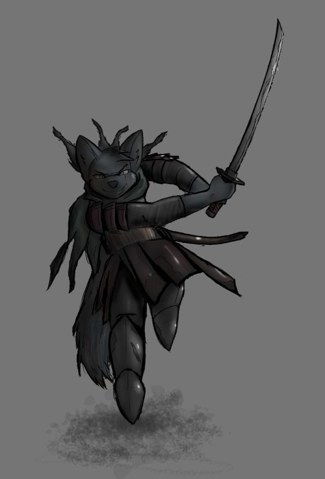
BeDaOrLiSeAr's Attempts: Drawings And Pictures - Page 17 Samura10

I decided to throw in some (rather ugly) thick lines. Why? CUZ I CAN. Crying or Very sad

Lol, I have no idea what I'm doing.

[weirdest pants evar...]

BeDaOrLiSeAr

BeDaOrLiSeAr

BeDaOrLiSeAr's Attempts: Drawings And Pictures - Page 17 Samura12

oh, god, the edges are so pixelated DX

BeDaOrLiSeAr

BeDaOrLiSeAr

With a different effect:

BeDaOrLiSeAr's Attempts: Drawings And Pictures - Page 17 Samura13

Nikolai

Nikolai

Ok, I have to say, I like the Final outcome. Looks pretty good.

http://nikolai-bartolf.deviantart.com/

BeDaOrLiSeAr

BeDaOrLiSeAr

Nikolai wrote:Ok, I have to say, I like the Final outcome. Looks pretty good.

Thanks, but now I won't be able to post anything until I think it's at least equalled this one ....

Dreadstunlock


Now this Beda! is the shit! Well done dude! That looks phenomenal!

BeDaOrLiSeAr

BeDaOrLiSeAr

Dreadstunlock wrote:Now this Beda! is the shit! Well done dude! That looks phenomenal!

Thanks!

BeDaOrLiSeAr

BeDaOrLiSeAr

While I hate it compared to the last one, I thought I'd post it anyways, as it is my first attempt at a paint-only (no lines) drawing. Funny, I had intended to draw it with lines, and I drew up some similar stuff, but I threw them out because I was feeling experimentatious (my made up word of the day). Just some random flamethrower-type character...

BeDaOrLiSeAr's Attempts: Drawings And Pictures - Page 17 Flamer10

Edit:XD on another site, someone pointed out that they thought it looked kinda like some "firebat" thingy from Starcraft. When I looked it up I almost died laughing


Last edited by BeDaOrLiSeAr on Sun Aug 14, 2011 9:03 am; edited 1 time in total

Frist

Frist

Lookin pretty boss, dude!

Well done!

BeDaOrLiSeAr

BeDaOrLiSeAr

Frist wrote:Lookin pretty boss, dude!

Well done!

Thanks! I've been trying to make my stuff look better through value and some other stuff (thanks to Dread for introducing me to FZD)

BeDaOrLiSeAr

BeDaOrLiSeAr

"Cousin! Want to go bowling?!"
"Sorry, Roman, I'm kind of busy right now. I'm in the middle of escaping from two gangs, a few helicopters, a hundred cop cars, and my government agent girlfriend."
"Oh, ok, maybe another time cousin."

For those who don't know what GTA 4 is or how bad*** Niko Bellic is : https://www.youtube.com/watch?v=xvNFCrM-eb4&list=FLlXzxnq4-wnRK-vKhDMuCZQ&index=2


My poor attempt at "fanart"

BeDaOrLiSeAr's Attempts: Drawings And Pictures - Page 17 Nico_b10

{gave him red eyes for the heck of it}

Dreadstunlock


Your painting needs to have a bit more light, you have seem to have all these type of "In the dark" drawings of the characters Razz

BeDaOrLiSeAr

BeDaOrLiSeAr

Dreadstunlock wrote:Your painting needs to have a bit more light, you have seem to have all these type of "In the dark" drawings of the characters Razz


Yeah, I've noticed that they seem really dark, at some points to the extent that details or lines can't be seen. Today I tried to make one that is brighter/more colorful:

BeDaOrLiSeAr's Attempts: Drawings And Pictures - Page 17 Power_10

Due to a lack of color-picking ability, I've named it the "Watermelon-Warrior"

Nikolai

Nikolai

I like the um...wings?

http://nikolai-bartolf.deviantart.com/

BeDaOrLiSeAr

BeDaOrLiSeAr

Nikolai wrote:I like the um...wings?

Thanks, yeah, they are wing-ish things, like, robot...wings... but made of metal...and stuff. Mainly just decoration, though the pads on the sides of each could serve as a levitation device... if you're creative...

Sponsored content


Back to top  Message [Page 17 of 19]

Go to page : Previous  1 ... 10 ... 16, 17, 18, 19  Next

Permissions in this forum:
You cannot reply to topics in this forum